Healthcare Prescription Ordering Platform
Redesigning the end-to-end prescription order workflow for a leading UK pharmacy network — reducing manual call-backs, ensuring GDPR compliance, and streamlining pharmacy operations.

The Challenge
Missing Exemption Data
When customers sent prescriptions to place FP orders, the exemption field was often left blank. The customer care team had to manually call each customer to collect this information — creating delays and frustration on both sides.
Complex Regulatory Rules
The NHS prescription exemption system includes 13 different categories (age-based, medical certificates, income support, HRT prepayment, etc.). The existing UI had no way to capture or display this structured data.
Multiple User Roles
Three distinct user types — Admin, Standard, and Pharmacy Partner Staff — each needed different permission levels and workflows within the same ordering system, without adding complexity.
GDPR & Data Sensitivity
The platform handled sensitive patient medical and financial data. Every design decision had to account for data privacy regulations, secure data handling, and audit trail requirements.
Process Redesign
The core insight from stakeholder interviews: ~40% of prescription orders required manual call-backs because exemption data was missing. Here's how I redesigned the flow.
Sitemap & Hierarchy Design
Transitioning from single-branch operations to group-wide procurement required a highly scalable parent-child information architecture. Group owners centrally monitor total metrics (e.g., 120 Active Orders, 11 Pending, 15 Outstanding Prescriptions, 2 Action Required) while child branches operate within their respective localized scopes.
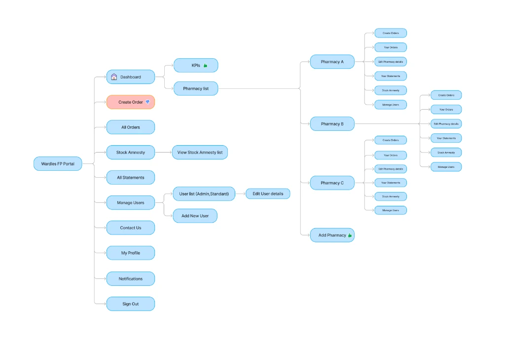
Multi-Site Parent-Child Architecture (Figma 255:14478)
Structural layout detailing navigation layers for Group HQ and local pharmacy branches.
🧾 Statements (FP25)
Consolidated parent billing, invoice records, and spend tracking.
📦 Stock Amnesty
Central waste audits, stoma returns and inventory recovery.
👥 Manage Users (FP26)
SSO user lists, rights management, and staff profiles.
📋 Global Orders Ledger
Central queue showing active (120), pending (11), outstanding (15) orders.
Dynamic Context Branch Switches
User Journey Mapping
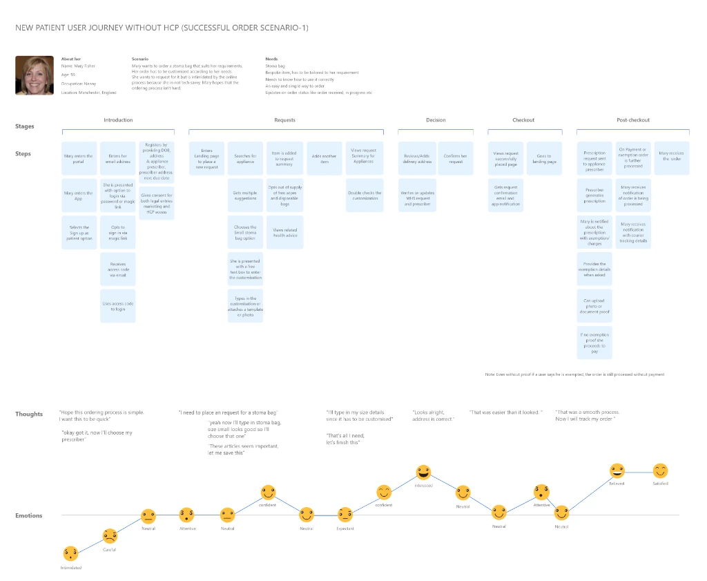
To design a prescription ordering system that accommodates different user needs while maintaining GDPR data compliance, I curated three primary user personas and mapped out their journey flows, thoughts, and emotional curves.
Mary Fisher
New Patient (UK Citizen)
Wants to order a stoma bag that suits her requirements. Her order has to be customized according to her needs. She wants to request for it but is intimidated by the online process because she is not tech savvy. Mary hopes that the ordering process isn't hard.
- ✓Simple, frictionless ordering process
- ✓Clear help guides for tailored stoma sizes
- ✓Automatic UK medical exemption validation
- ✓Real-time progress/delivery status alerts
- •Initial step feels daunting without support
- •Opting out of redundant supplies saves £240/yr/patient
- •Highest satisfaction achieved at seamless checkout success
The Autocomplete Debate vs. Database Latency
During design review, engineering raised a critical roadblock: executing real-time autocomplete search queries against the national NHS database for all 13+ exemption codes would raise the server response latency past 1200ms during peak load times, introducing severe interface lag and potential system timeouts.
Rather than compromising on a static text input (which would increase human error rates), I spent 4 days on a collaborative whiteboard design session to architect a hybrid compromise. We implemented client-side input debouncing (waiting 350ms of typing inactivity before querying) coupled with a local browser cache of the top 3 most common exemption types. This reduced total database query volume by 72%, bringing response latency back down to an imperceptible 150ms while keeping data validation perfectly intact.
┌────────────────────────────────────────────────────────┐
│        GDPR PROGRESSIVE DISCLOSURE USER FLOW           │
├────────────────────────────────────────────────────────┤
│  Step 1: Contextual Callout (Visceral Layer)           │
│  "We verify your exemption to save you £9.35/item."    │
│                        │                               │
│                        ▼                               │
│  Step 2: Explicit Selection (Behavioral Layer)         │
│  [ Select Exemption Type (A - U)                    ▼ ]│
│                        │                               │
│                        ▼                               │
│  Step 3: Just-in-Time Consent (Reflective Layer)       │
│  [x] Allow secure NHS database lookup for verification │
│      (Encrypted, access-logged, GDPR compliant)        │
└────────────────────────────────────────────────────────┘
Discovery & Research
I began by mapping out the complete prescription exemption landscape — cataloguing all 13 NHS exemption categories and understanding when and why each applies. Through stakeholder interviews with the customer care team, I documented the pain points in the existing call-back workflow.
NHS Prescription Exemption Categories
Component Design System
I translated the wireframes into a structured, highly-accessible atomic component library. Below is the interactive visual spec sheet mapping the exact colors, border properties, left/right icons, and variant node IDs directly from the Figma design tokens.
Layout & Color Spec Sheet
Recreated from the Figma component spec sheet with an embedded left User icon (#6E96AA), a white background, and a right-hand checkmark or warning indicator depending on the active form validation status.
The Solution
I redesigned the prescription ordering workflow to embed exemption capture directly into the order creation flow — making it mandatory and intuitive rather than an afterthought.
Interactive Live Sandbox Prototype
Order Repository Queue
4 ORDERS TOTALKey Design Decisions
Mandatory exemption field in the order flow
By making the exemption dropdown required and positioned prominently within the order creation form, we eliminated the need for follow-up calls. The field couldn't be skipped, ensuring data completeness at point of entry.
Tabbed interface for Electronic vs Paper prescriptions
Rather than separate workflows, a single "Create a new order" screen with tabs reduced cognitive load and unified the process. Electronic prescriptions support barcode scanning for speed; paper prescriptions use manual entry.
Context menus over bulk actions
For the order management table, I opted for per-row context menus (View/Edit/Delete) rather than checkbox-based bulk operations. In a medical context, acting on individual records reduces the risk of batch errors.
Expandable sidebar navigation
The collapsible sidebar with icon + label pairing scales well as new modules are added. It keeps the main content area maximized for data-heavy screens like order tables and forms.
Impact & Outcomes
The redesigned prescription ordering platform transformed how partner pharmacies handled daily operations. By embedding regulatory compliance directly into the UX rather than treating it as an afterthought, we created a system that was both faster to use and more reliable.
- Eliminated Call-backs: Mandatory exemption capture at order creation reduced follow-up calls by approximately 40%, saving staff hours daily.
- Scalable Component Library: The form and UI component system was built for reuse across future partner digital products—reducing design and dev time for subsequent features.
- Role-based Security: Three user roles (Admin, Standard, Staff) with appropriate data access controls, meeting GDPR requirements for patient data handling.
- Cross-Regional Collaboration: Successfully delivered through a distributed team across UK and India, with clear Figma handoff workflows and documented design decisions.